When I started consulting with clients 15 years ago on the topic of logo design (in the context of brand identity), I found that the projects went more smoothly if I taught the client about all that goes into “good” logo design. The training included things like:
- Elegant simplicity
- Scalability
- Balance of positive/negative space
- Implied meaning
- Flexability
- Use of fundamental shapes
To emphasize the issue of elegant simplicity I would point out that they can drive down the road and see a little yellow curve, peeking through the trees up ahead. As soon as you see this, you KNOW that it’s a McDonald’s sign and you can immediately start prepping to exit for your next meal. No, you don’t need to see the whole thing. THIS is the power of a great logo.
Here we are, a decade and a half later and, apparently, Micky-Ds has found this same awareness and is capitalizing on it in their billboard advertising! Check it out:
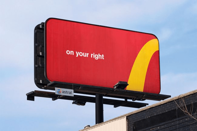
Bravo McDonalds!
A second lesson you can learn from this awesome billboard is; You don’t have more than a couple of seconds of the viewers attention! More than just a handful of words on a billboard and the viewer will simply look away. Three words with no punctuation? Yep, that works!